Great visuals capture attention. But the full impact often comes in revealing something surprising about it. At the same time, many people mistake PowerPoint as a script to read content during their presentation. In this blog we will highlight some of the major mistakes using PowerPoint, at the same time demonstrating the real power of how to get to the point with your presentation.
Intelligent content needs an emotional implementation. Communicate rational facts emotionally, since data leads to judgements, not decisions. When logic meets emotion, messages are not only heard but also understood.
If using PowerPoint or any other presentation software, you should work with photos and images: Emotional and colorful visuals are more likely to be noticed than plain text. Large letters attract attention and cause a faster, longer, and more emotionally loaded audience reaction compared to small fonts.
What do you reveal in your first Slide?
Compare the two following slides and decide which one raises audience attention. The first slide is too colorful and not consistent in terms of style and font. Do we really need to include each single institution and sponsor? While this might be requested by your organizations, it is of no extra value from a pure presentation perspective. The second slide reduces information to a minimum, mentioning both speech title and speaker combined with an impactful image.

The latter is to be discussed: You may prefer a more factual approach in a business context or while defending your PhD thesis. On the other hand, the illustrated slide creates a more emotional effect and might be appropriate for informal event or a Science Slam. Another aspect to consider is title length: Especially research titles are too detailed. I suggest using a short, catchy title. If appropriate, combine it with a more precise subtitle including key expressions.
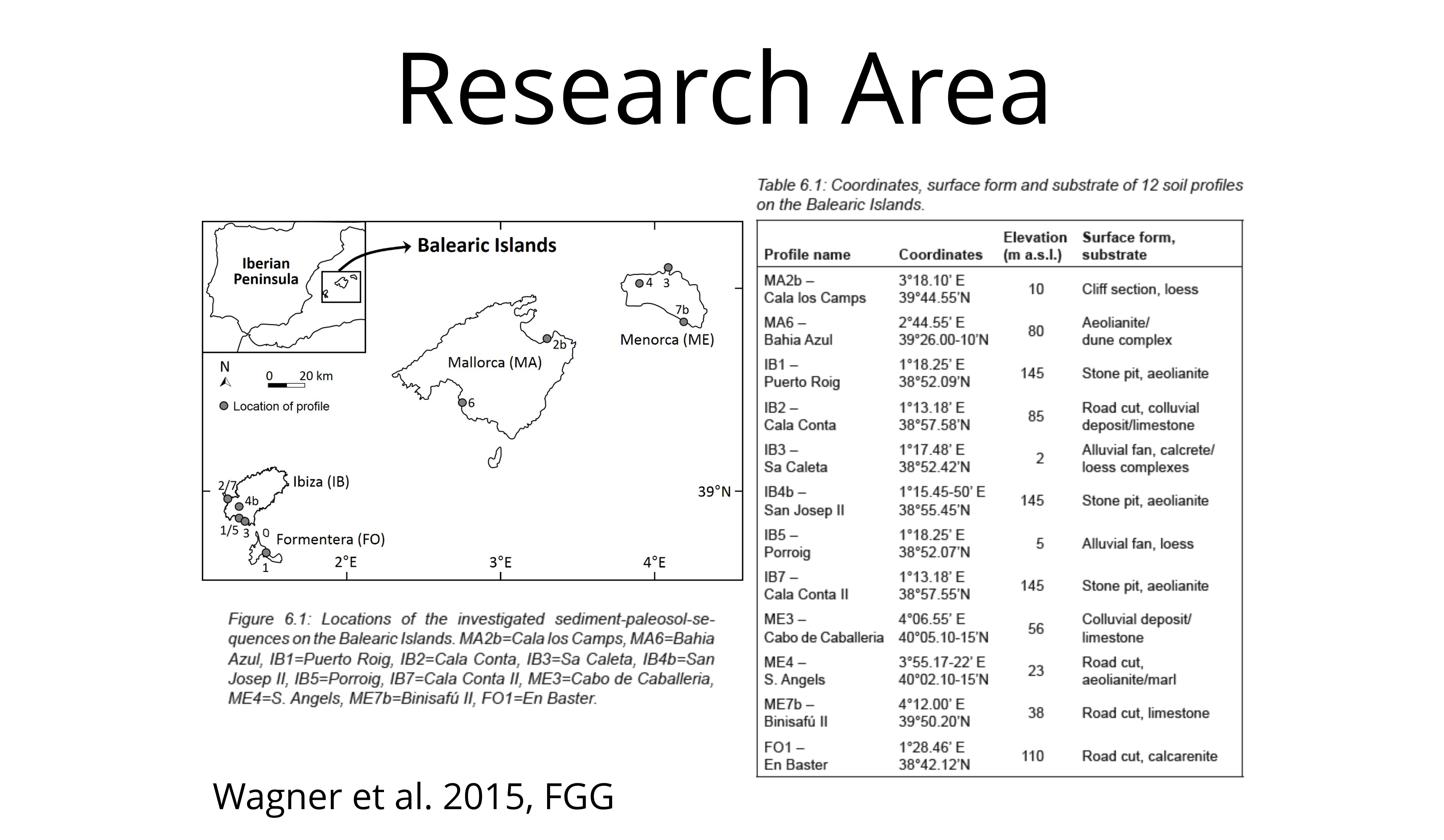
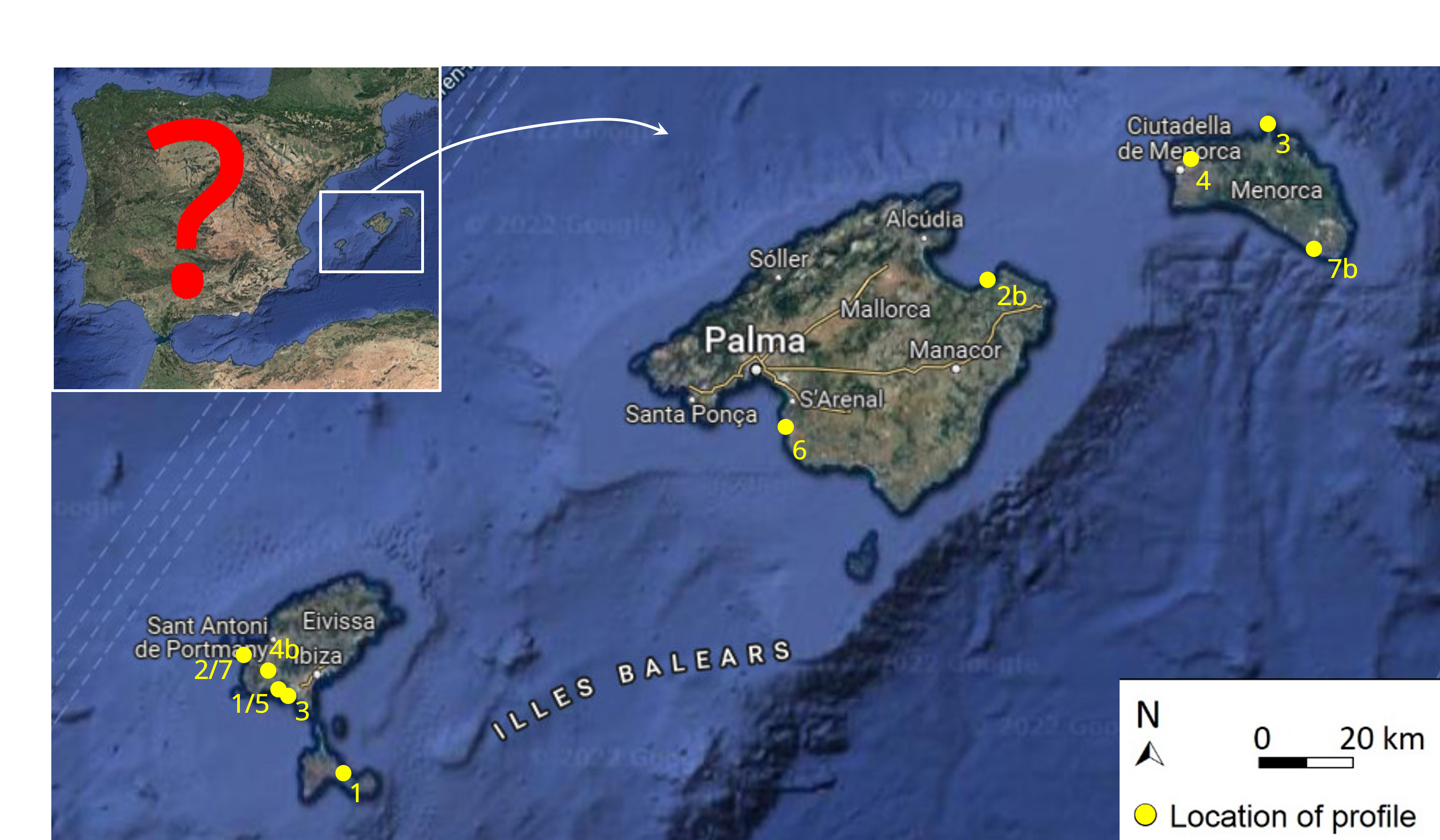
Clean up your Slides: Maps are Storytellers
The next slide is cluttered with unnecessary information. We do not need to share exact locations of research sites in a presentation. Map descriptions are of no extra value either. Even the title “Research Area” is redundant since we can mention it verbally. In the example at hand, I suggest enlarging the map to the full slide while removing table and figure descriptions without substitution. Depending on the target audience, we do not even need to share the research area as being a part of Spain. It might be appropriate at an international congress or while presenting outside Europe, but it is redundant in Western Europe and definitely in Spain.
Tables out, Visuals in!
Some presentations highlight detailed results in complex tables. Those who see the following table for the first time will need some time to read in and see all the details.
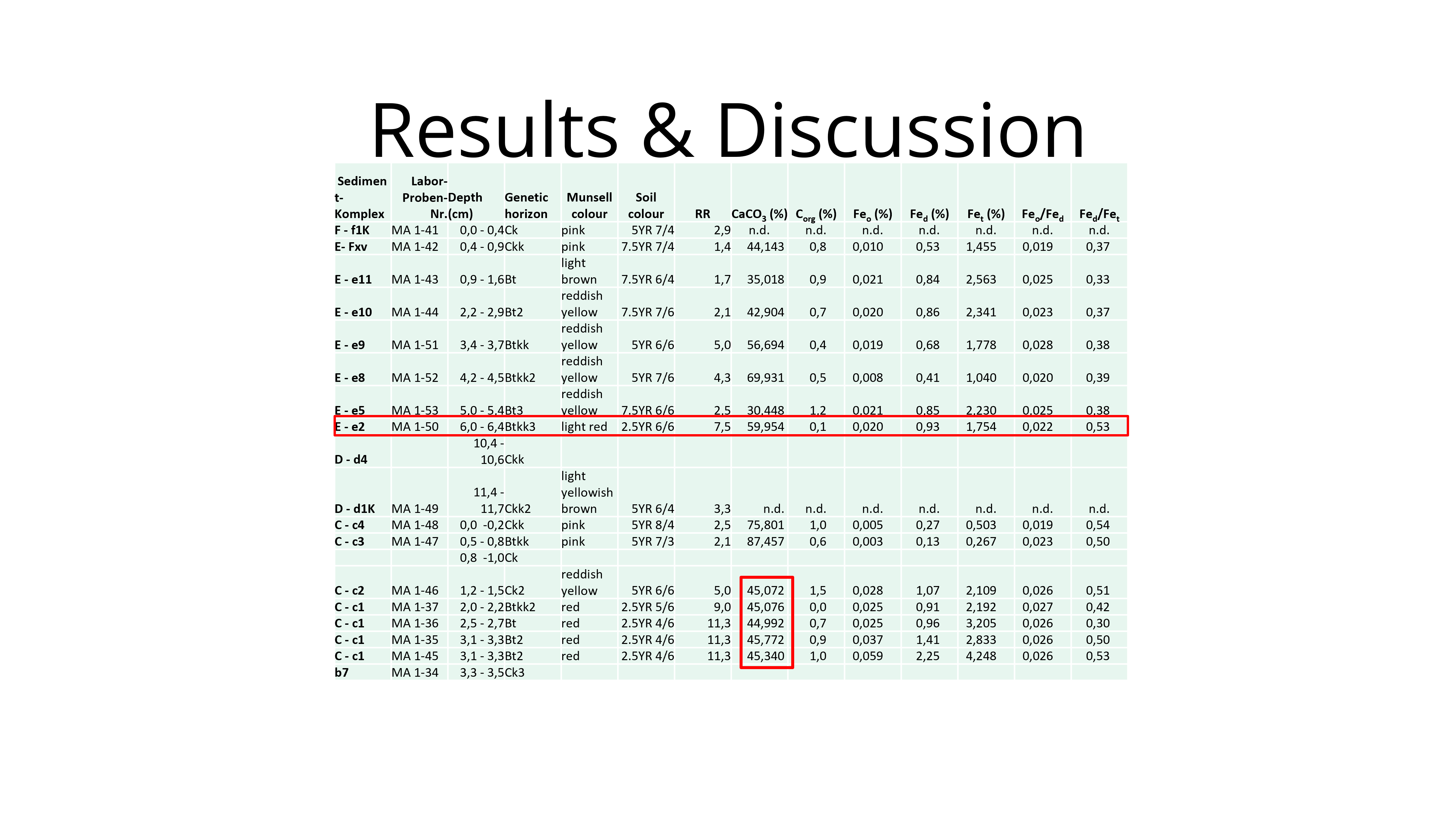
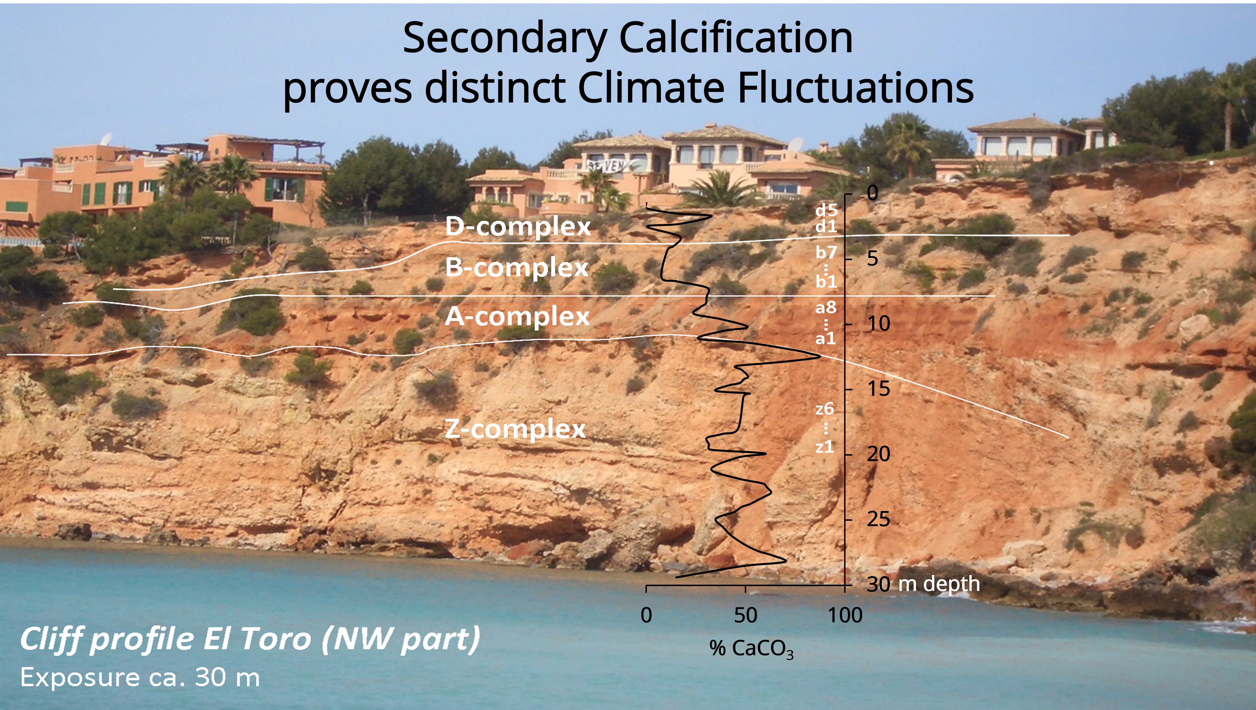
As a presenter you are however challenged to ensure that your audience can quickly grasp your content. Tables might be fine for your PhD thesis and publications, while a visual presentation should translate complex information in a stepwise approach. For the following visual slide, you may want to start with the image and location before highlighting the main results (here: a graph of CaCO3 contents in soil). After explaining those results, you can also include a brief conclusion as on the top of this slide.
Images not Text on Slides: Less is more
The following two slides have been discussed in a former blog contribution already: https://redelandschaften.de/en/present-with-pechakucha/
What stands out on the first of these slides are at least four aspects, highlighting some common mistakes regarding presentation slides:
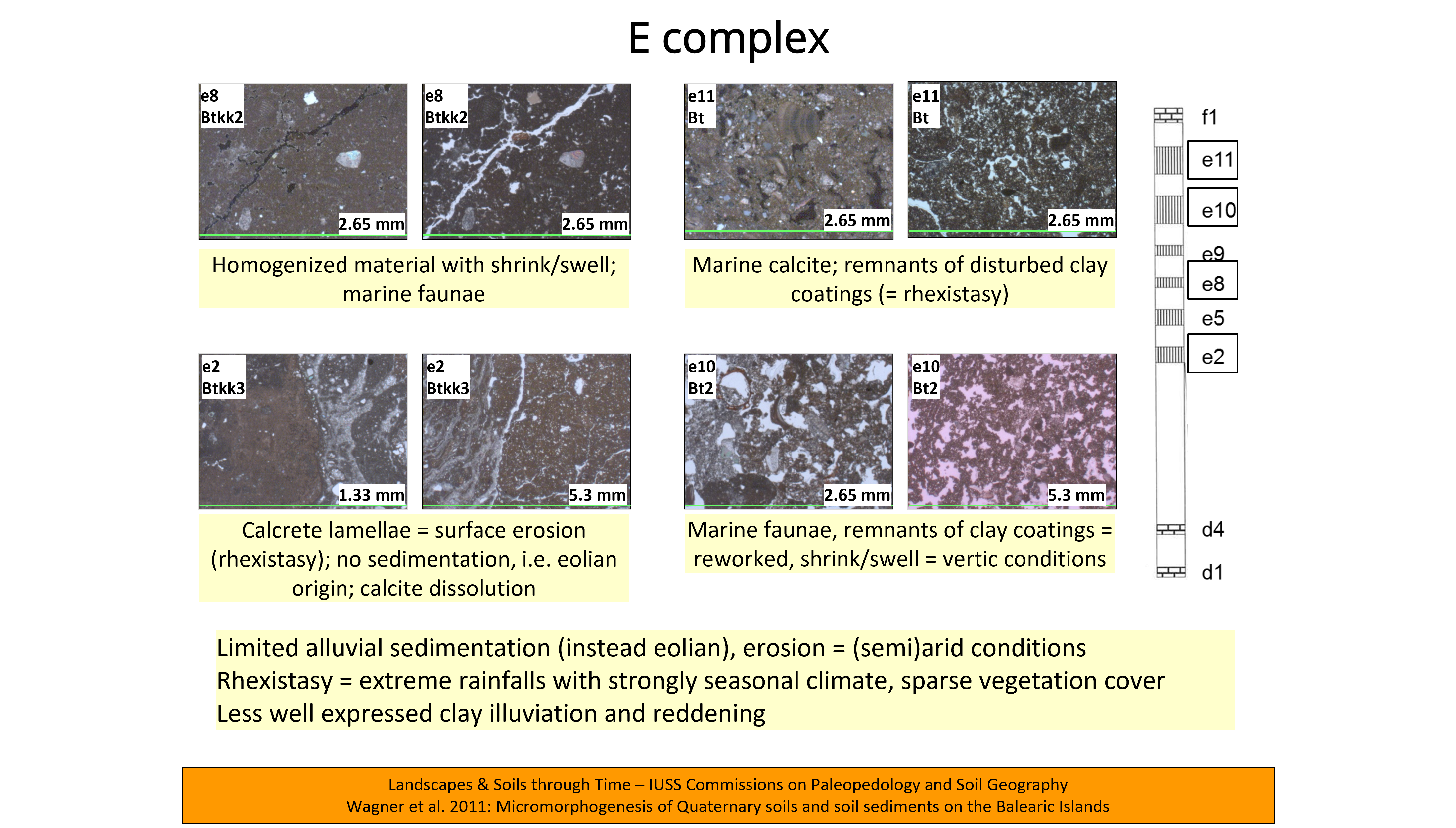
- It is heavily overloaded with eight images. Instead, I recommend single images completely covering single slides. It is self-evident that microscope images should be as large as possible (at the highest possible resolution).
- Images do not reflect the natural order as shown by the model on the right. The audience first must elaborate on the spatial relationship of the images. If these are placed in spatial relation to each other, the vertical sequence e11 – e10 – e8 – e2 is the best choice. Presenting four single slides, each with a picture in the appropriate order, would avoid any possibility of confusion.
- The slide is text heavy. I suggest reducing words to a minimum. The audience will focus on your spoken words, so you can remove them from presentation slides. Leave them on handout slides instead. Arrows or markers in the photo may explain and underline important characteristics. In any case, the written words are hard to read with font size 12. Technical literature recommends a size of 18-24 pt, and 28-36 pt for the title.
- The speaker may display presentation title on the first slide only. Repetitive information at the bottom of the screen does not provide any useful information but rather overloads the slide.
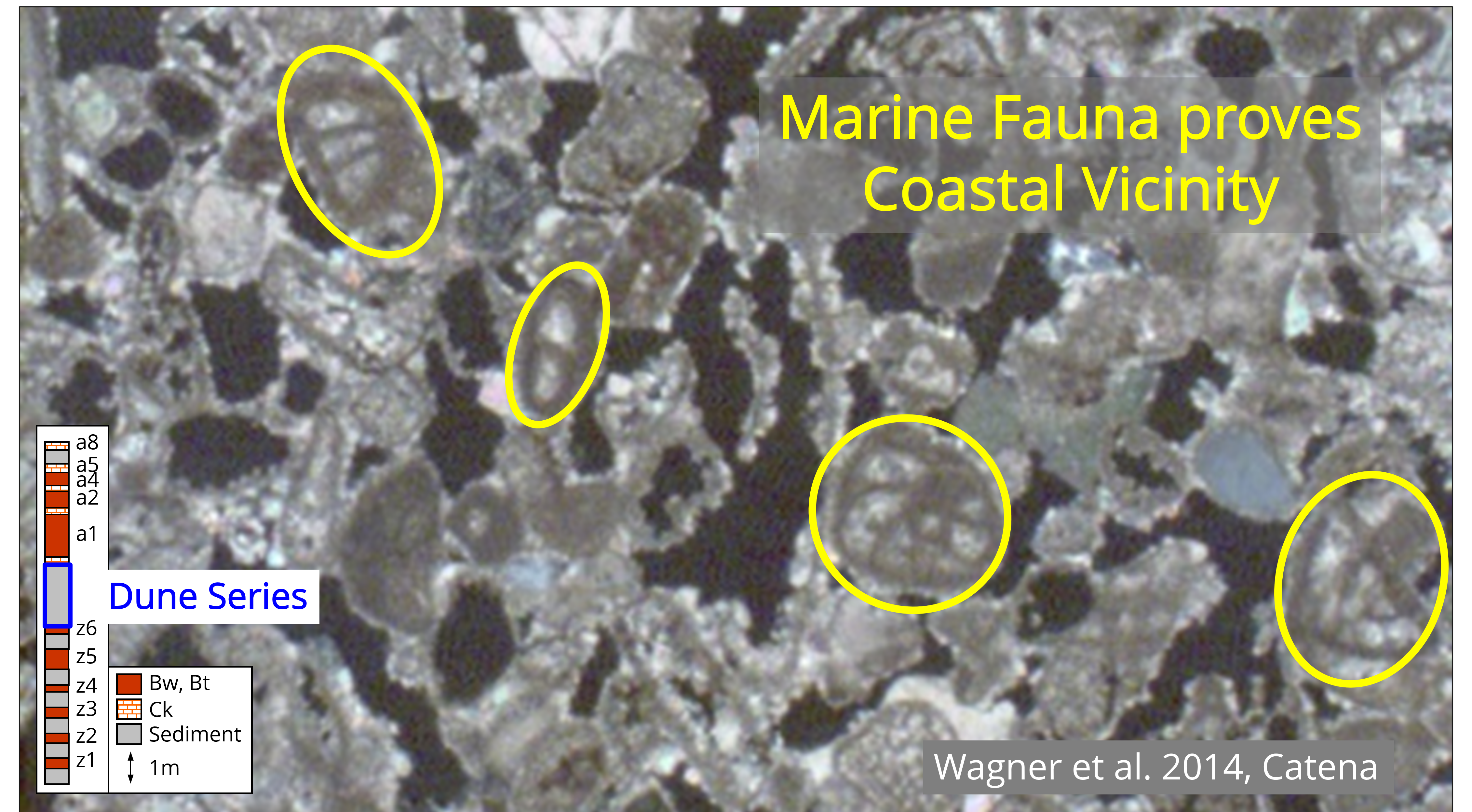
A better approach is to highlight a few selected images on separate slides, with little or no text while highlighting differences and/or time development. You may combine expressive and emotionally charged images with short metaphors or a conclusion, as on the following slide with a single image. Here you can even start a quiz by asking your audience whether they can recognize details (here: marine fauna, highlighted within yellow circles). This way you encourage them to think and participate at the same time. Like on the former slide you can even summarize a short conclusion. It corresponds to a one-sentence pitch for this section of your presentation, like the one we work on in my Science Pitch trainings. https://redelandschaften.de/en/training/#sciencepitch
Summarize your Conclusions
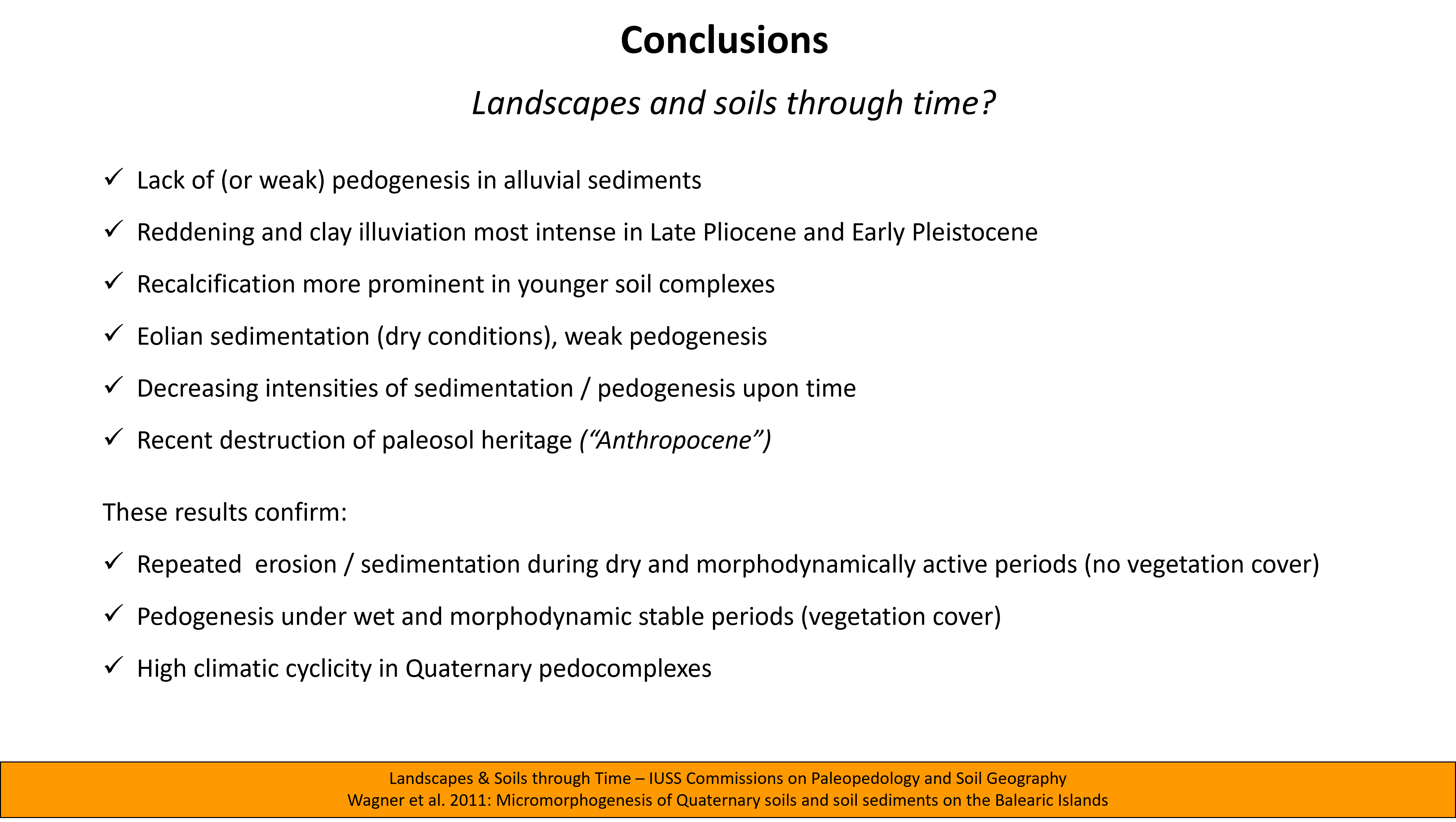
I have seen hundreds of presentations where conclusion and summary are presented using a detailed text slide. I have done this myself for many years. But there are better alternatives: a visual summary like the one on the right, or a black slide, as we will see in a moment. You can move written summaries to the handout instead.

How to finish your Talk effectively
How do most people finish their presentation? They love to share “thank you slides”, or even an extensive list of literature resources. While the latter might be part of your handout, I suggest removing this slide without substitution. It is of no extra value for your audience. A black slide is a much better alternative, since your audience will shift its focus away from slides turning towards you. Now that you have gained full attention, you can deliver your last words: Your key message, a call to action or an inspirational and possibly a short “Thank you!”.

I have summarized this blog in a video applying the popular PechaKucha format: https://youtu.be/i8EZ7gEeoLM The video highlights some dos and don’ts on visuals, including best-practice examples. If you want to ultimately transform from “Death by PowerPoint” to a real “Success with PowerPoint”, this video is for you.
In addition, I can recommend two popular videos highlighting dos and don’ts regarding visual presentations. The first is presented by David McCandless and his TED Talk “The Beauty of Data Visualization”. He also plays with words and therefore succeeds with one of my personal favorite TED Talks: https://www.ted.com/talks/david_mccandless_the_beauty_of_data_visualization?referrer=playlist-how_to_make_a_great_presentation
The second video is from 2010 already, with Don McMillan presenting “Life after Death by PowerPoint”: https://www.youtube.com/watch?v=KbSPPFYxx3o
What are your experiences regarding “Death and Survival by PowerPoint”? Let me know in your comment!
This post is also available in: German


Leave a Reply
Want to join the discussion?Feel free to contribute!